Test Documentation & Protocol
1. Heuristic Evaluation
- Scope: Initial Prototype
- Evaluators: Self-evaluation by team members
- Date: 13.01.2026
Results & Findings
| Description | Heuristic | Severity |
|---|---|---|
| Ambiguous "Reader" Tab Logic: Having "Reader" as a primary bottom navigation tab (Global) is confusing. A "Reader" is typically a mode triggered by opening a specific book. If a user taps this tab without an active book, it is unclear what will be displayed (likely an error or empty state). | #2 | 2 |
| The "Yearly Reading Goal" widget appears identically on both the "Badges" and "Stats" screens. This duplicates information and clutters the interface without adding new context. | #8 | 1 |
| The "JABA" logo header takes up significant vertical space on every screen. On mobile devices, vertical space is premium. This branding should likely be smaller or disappear on scroll to show more content. | #8 | 1 |
| The "Check-in" screen blocks the user entirely if they have no books marked as "Reading." Instead of a dead end, this screen should allow the user to generally check-in without having a book selected. | #7 | 3 |
| The "Reader" screen displays the global bottom navigation bar while the book is open. Reading interfaces usually default to a full-screen "immersive" mode to minimize distraction and maximize the reading area. | #8 | 2 |
| On the "Library" screen, the "Filter by Shelf" and "Manage Shelves" actions are text-only links that appear quite small. This may be difficult for users with larger fingers to tap accurately compared to the larger "pill" buttons above them. | #4 | 2 |
| When searching for a book there is no system feedback while typing, leaving the user unsure if the search is working. | #1 | 1 |
| The UI design of the "Reader" Screen is inconsistent with the other screen (smaller top bar and title). | #4 | 1 |
| No System Feedback when the Status of a book has been changed. User is unsure whether status was changed or not. | #1 | 2 |
| Not clear that deleting review is also deleting the reading entry (status). | #5 | 3 |
| Ratings are very hidden. User might not realize that this is even an option. | #6 | 2 |
2. User Testing Plan
This section outlines the plan for the upcoming user tests on the functional application.
A. Hypothesis & Testable Questions
Q1: To what extent can users efficiently add books to their library using the available methods (search, barcode scanning, and manual entry)? (SEQ >= 6)
Q2: How effectively can users organize their library and retrieve specific books after they have been added, including creating and using custom shelves, applying filters or search, and understanding the library’s organizational structure? (SEQ >= 6)
Q3: How accurately and can users manage a book’s reading lifecycle, including updating reading status, attaching and opening digital files, and transitioning into the reading experience without losing context or progress? (SEQ >= 6)
Q4: How confidently are users when using the app and its functionalities? (SUS)
B. Data Collection (Dependent Variables)
Quantitative Metrics:
- Task Success Rate
- Error Rate
- Perceived Ease (SEQ)
- Perceived Usability (SUS)
Qualitative Data:
- User verbal feedback (Think-Aloud protocol).
- Observer notes on hesitation or confusion.
C. Methodology
1. Test Setup & Participants
- Format: Moderated In-Person Usability Test.
- Participants: 8 participants.
- Procedure: Test 4 participants (formative testing), implement the feedback and then test at least 4 more participants (summative testing).
- Criteria: Students or casual readers who use smartphones daily.
- Environment: Quiet room / University lab.
- Protocol: Think-Aloud. Users will be asked to speak their thoughts freely while performing tasks.
2. Procedure
- Microsoft-Form: https://forms.cloud.microsoft/e/8Fcyjxx8ji
- Introduction (2 min): Explain that we are testing the app, not the user. Have them sign an Informed Consent Form.
- (Demographic) Pre-Test Questionnaire (2 min): "How often do you read?" / "Do you track your reading currently?" (Age, Gender, Occupation, Smartphone usage)
- Task Execution (10 min): User performs the 6 scenarios listed below.
- Post-task (1 min): SEQ after each task.
- Debriefing (3 min): SUS.
3. Tasks
Task 1 (Search & Add)
"A friend gave you a copy of their favorite book. Use the app's scanner to find the book via its ISBN and save it to your library."
Task 2 (Status Management)
"You have decided to start reading this book immediately. Change book's status to 'Currently Reading'."
Task 3 (Habit Building)
"You want to log your reading activity for today to keep your streak alive. Perform your daily check-in."
Task 4 (Reader)
"Imagine you have a PDF for the previously added book. Attach the file to the book in your library. Open the file in the Reader."
Task 5 (Reading Progress)
"Imagine you have finished the book. Log it as finished and give it a rating."
Task 6 (Rewards)
"Check if you have earned any new badges for your activity."
3. Results & Findings
A. Quantitative Results
SEQ (Single Ease Question) — raw data (per task, per participant)
| Participant | T1 SEQ | T2 SEQ | T3 SEQ | T4 SEQ | T5 SEQ | T6 SEQ |
|---|---|---|---|---|---|---|
| P1 | 7 | 5 | 7 | 7 | 2 | 7 |
| P2 | 7 | 6 | 7 | 7 | 6 | 7 |
| P3 | 7 | 4 | 7 | 7 | 5 | 7 |
| P4 | 7 | 7 | 7 | 7 | 5 | 7 |
| Post-Improvements | T1 SEQ | T2 SEQ | T3 SEQ | T4 SEQ | T5 SEQ | T6 SEQ |
| P5 | 7 | 7 | 7 | 7 | 7 | 7 |
| P6 | 7 | 7 | 7 | 7 | 6 | 7 |
| P7 | 7 | 7 | 7 | 6 | 7 | 7 |
| P8 | 7 | 7 | 7 | 6 | 4 | 7 |
SUS — raw data (per participant)
| Participant | SUS Score (0–100) |
|---|---|
| P1 | 95 |
| P2 | 95 |
| P3 | 92.5 |
| P4 | 100 |
| Post-Improvements | SUS Score (0–100) |
| P5 | 100 |
| P6 | 97.5 |
| P7 | 100 |
| P8 | 97.5 |
Summary
| Metric | T1 | T2 | T3 | T4 | T5 | T6 | Overall |
|---|---|---|---|---|---|---|---|
| Pre-Improvements SEQ mean | 7 | 5.5 | 7 | 7 | 4.5 | 7 | 6.333 |
| Pre-Improvements SEQ median | 7 | 5.5 | 7 | 7 | 5 | 7 | 7 |
| Post-Improvements SEQ mean | 7 | 7 | 7 | 6.5 | 6 | 7 | 6.75 |
| Post-Improvements SEQ median | 7 | 7 | 7 | 6.5 | 6.5 | 7 | 7 |
| Metric | Value |
|---|---|
| Pre-Improvements SUS mean | 95.63 |
| Pre-Improvements SUS median | 95 |
| Post-Improvements SUS mean | 98.75 |
| Post-Improvements SUS median | 98.75 |
B. Summary of Qualitative Results
- Lack of system feedback for changing status or adding a book
- Rating feature hard to discover
- Issues for Landscape Mode: PDFs are cropped, check-in screen not scrollable
- Design feedback: Inconsistent chips for shelves, "plus" for adding books does not look like button
Implemented Feedback
- Increased the tap area of the “+” icon, turning it into a clear button for easier book addition.
- After adding a book, users are now redirected to the library view instead of the book detail view.
- Replaced “Search” in the FAB menu with “Scan ISBN” to reduce confusion.
- Updated offline behavior: when searching offline, the app now shows “You’re offline” instead of “No book found.”
- Added system feedback when changing reading status.
- Tapping the library icon from book detail always navigates back to the library.
- Reading Status is now a drop-down menu.
B. Visualizations
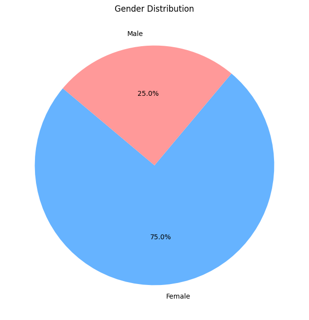
1. Participant Demographics
| Gender Distribution | Age Distribution |
|---|---|
 |
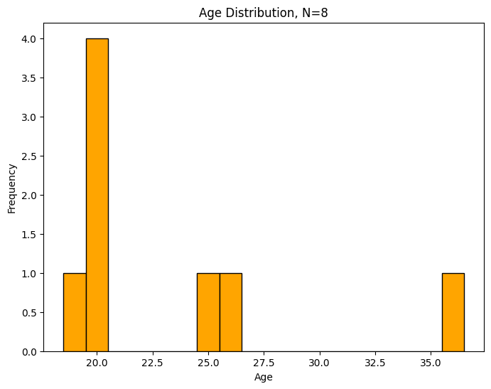 |
| Majority of participants were female. | Participants ranged from 19 to 36 years old. |
2. Usability Metrics (Comparative Analysis)
The following box plots compare the user experience between the initial prototype and the improved version, which was tested after implementing the feedback from the first four testers.
System Usability Scale (SUS)
The SUS score measures the overall perceived usability of the system.
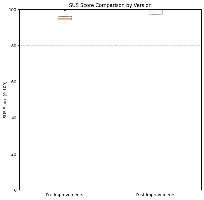
Both versions achieved high SUS scores, with the improved version showing even tighter consistency and higher mean scores.
Single Ease Question (SEQ)
The SEQ scores were collected after each of the 6 tasks to measure the perceived difficulty (1 = very difficult, 7 = very easy).
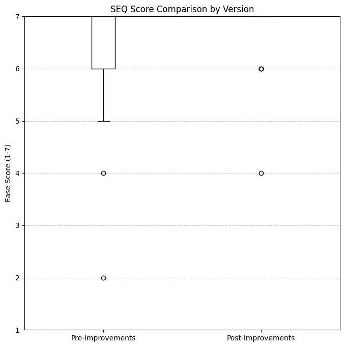
Version B shows a slight improvement in task ease consistency, narrowing the range of lower scores found in Version A.